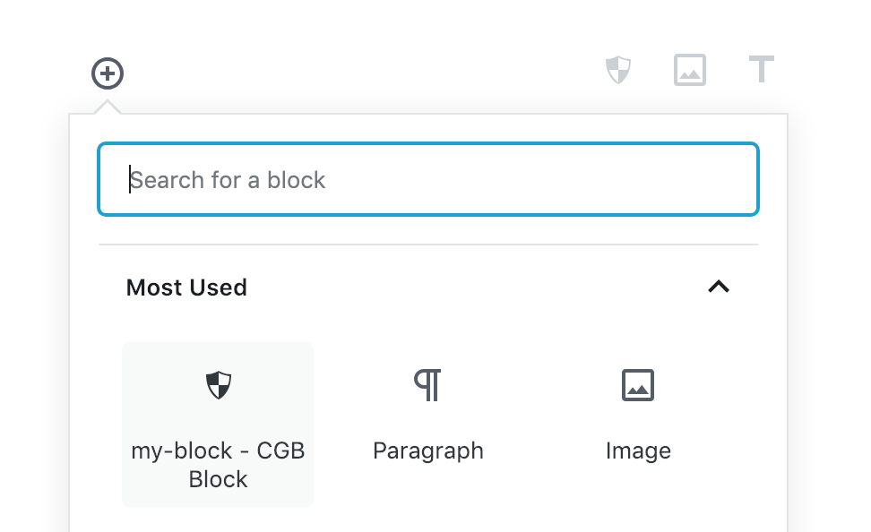
今回は、Gutenberg Handbook の「ColorPalette」を参考に、このコンポーネントを使ったサンプルを作ってみました。
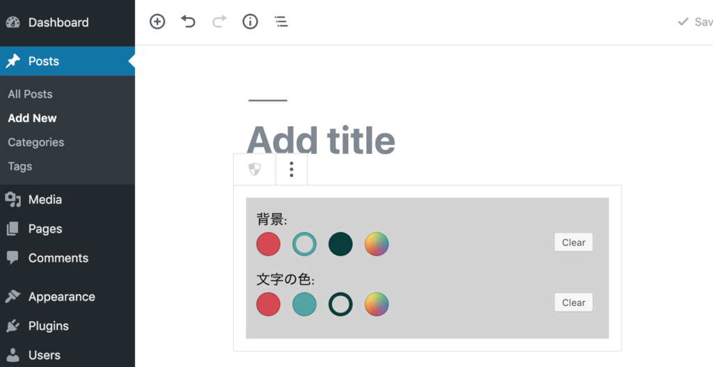
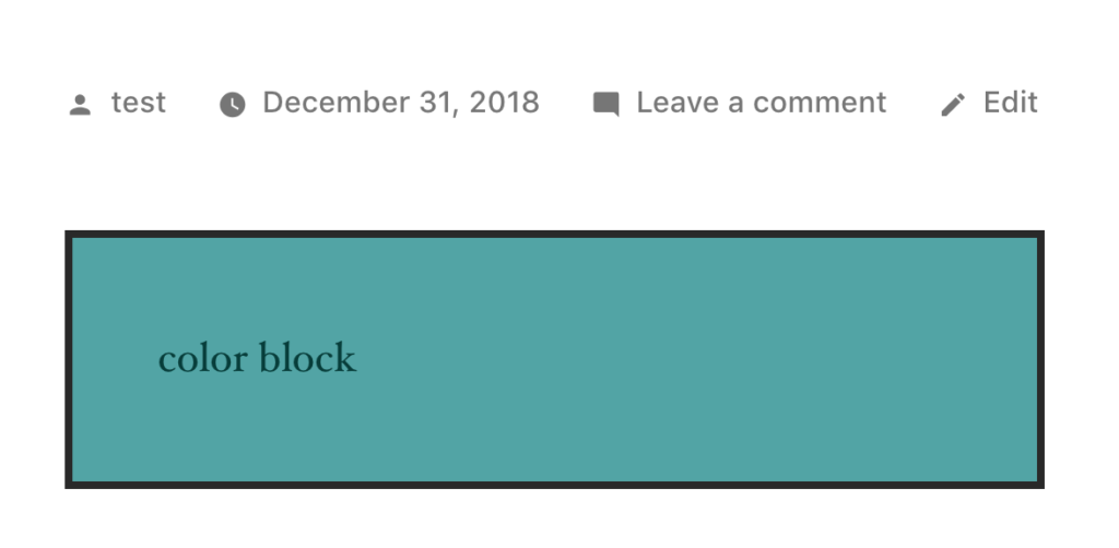
Editorモードで、文字の色と背景色、をカラーパレットでえらんだら、記事に「color block」という文字を、選んだ色で表示するBlockを作っていきます。出来上がると、こんな感じです。
Edit
記事
作成準備
今回、create-guten-blockというジェネレータを使って元になるBlockを作成して、block.jsファイルをカスタマイズという流れです。まずは、元になるBlockを作成するために次のコマンドを打ちましょう。
pluginsフォルダに移動
ターミナルを開いて、自分のwordpressのpluginsフォルダで実行します。私の場合、こんな感じのフォルダ。
cd /var/www/html/wp-content/pluginsBlockを作成
移動したら、「create-guten-block」コマンドで、pluginのテンプレートをジェネレート
npx create-guten-block my-block
cd my-block
これで、元になるBlockの作成が終わりました。今回は、追加のライブラリを使うので、@wordpress/components をインストール。
npm install @wordpress/components --saveここまで行ったら、次のコマンドを打って、自動ビルドをSTARTします。
npm startColorPaletteを実装
それでは、コードの実装をしていきます。次のファイルを編集していきます。 my-block/src/block/block.js
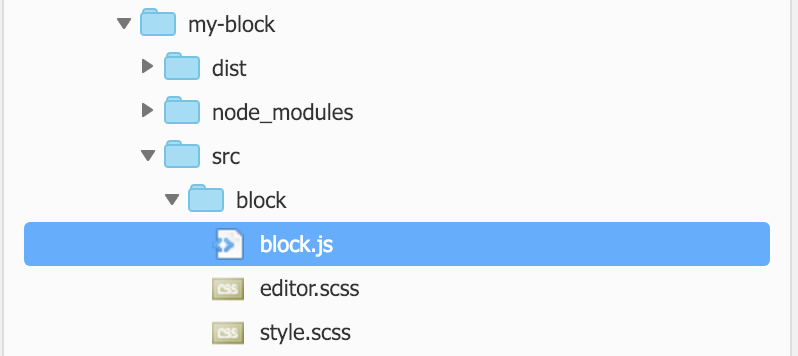
block.js
基本的には、参考にしたサイト「ColorPalette」のソースを書いていけば動くのですが、editとsaveの間で colorの値を受け渡しするために、setAttributes を組み込んでいます。
/**
 * BLOCK: my-block
 *
 * Registering a basic block with Gutenberg.
 * Simple block, renders and saves the same content without any interactivity.
 */

//  Import CSS.
import './style.scss';
import './editor.scss';

const { __ } = wp.i18n; // Import __() from wp.i18n
const { registerBlockType } = wp.blocks; // Import registerBlockType() from wp.blocks
import { ColorPalette } from '@wordpress/components';
import { withState } from '@wordpress/compose';

const MyColorPalette = withState( {
    color: '#f00',
} )( ( { color, setState, onChange } ) => {
    const colors = [
        { name: 'red', color: '#D8464F' },
        { name: 'lightgreen', color: '#4BA4A6' },
        { name: 'green', color: '#003D3A' },
    ];

    return (
        <ColorPalette
            colors={ colors }
            value={ color }
            onChange={ ( color ) => {
	            onChange(color);
    		    setState( { color } );
            } }
        />
    )
} );

registerBlockType( 'cgb/block-my-block', {
	// Block name. Block names must be string that contains a namespace prefix. Example: my-plugin/my-custom-block.
	title: __( 'my-block - CGB Block' ), // Block title.
	icon: 'shield', // Block icon from Dashicons → https://developer.wordpress.org/resource/dashicons/.
	category: 'common', // Block category — Group blocks together based on common traits E.g. common, formatting, layout widgets, embed.
	keywords: [
		__( 'my-block — CGB Block' ),
		__( 'CGB Example' ),
		__( 'create-guten-block' ),
	],


	edit: function( {setAttributes} ) {
		return (
			<div style={{background: 'LightGray', fontSize: '16px', padding:'12px'}}>
				背景:
				<MyColorPalette onChange={ (background) => setAttributes({background}) }></MyColorPalette>
				文字の色:
				<MyColorPalette onChange={ (color) => setAttributes({color}) }></MyColorPalette>
			</div>
		);
	},

	save: function( props ) {

		var divStyle = {
			color: props.attributes.color,
			background: props.attributes.background,
			width: '100%',
			height: '100%'
		}
		return (
			<div style={divStyle}>
				color block
			</div>
			);
	},
} );
Blockを確認
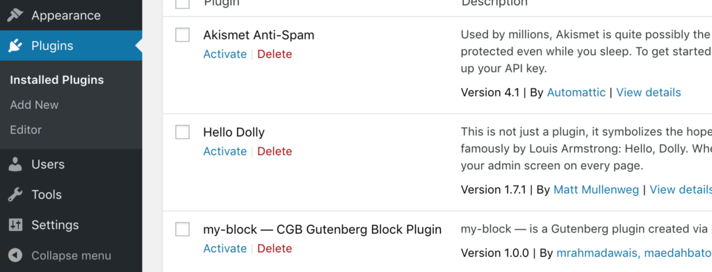
wordpressの設定画面で、pluginをactivateしたあと、記事の投稿でBlockが使えるようになっていれば完成です。(※ Plugin名、Block名は、ジェネレーターで作成されたものをそのまま使っていれば、my-block と言う名前になっていると思います。)
plugins
記事の作成中